
Millennuium Idols Part II

fig. 5 (repeated): The millennium idol of the late 1970s and early 1980s
(Go to Part I)
This essay primarily addresses the misconception that prior to the IPCC First Assessment there prevailed in paleoclimatology the picture of a generalized warming that reach an outstanding peak in the high Middle Ages. We have not found this. Indeed, we have not found much interest at all in depicting a generalized temperature trend (whether hemispheric or global) across the last millennium. In 20th century paleoclimatology the interest at this timescale was much more in the patterns of climate variability found to be shifting slowly across vast regions of the globe. Out of this work emerged the various theories of climatic oscillations and of the impact of climate change on human history.
But this is not to say that there was no demand for the depiction of a generalized temperature trend on this time scale. Indeed, during the 1970s and 1980s this demand emerged in the assessments commission by governments in response to the global climate change scares. It was just that, for this demand, the science and the scientists were ill prepared.
Nevertheless, in 1975 one millennium graph was chosen to depict a generalized trend, a version of which is given in fig 5 above. This trend line was repeatedly used though to the 1980s in reports assessing the risk of a human impact on climate. Not all the various assessments during the 1980s depicted a generalized millennium temperature trend (e.g., not this one associated with the Villach ’85 conference (1)). But, where a trend was given, (at least, as we have found so far) only various versions of this graph (fig. 5) were used.
Two other millennium graphs have also been found in use during the 1980s to give the generalized trend, but these were not in assessment reports, nor the primary literature. They are found in textbooks, one by Davis, the other by Tickell. As Steve McIntyre noted in a comment (here) on our Part I, it seems to be from the latter that the IPCC graph is derived. What can we say about the transition to this new and very different looking chart? The IPCC First Assessment authors must surely have known the previous usage in the previous assessments, and so they would have consciously chosen the new graph (whether or not via Tickell) for their new assessment.
Not until the late 1990s did a group of scientists set out to meet the demand of the climate change assessments for a generalized millennium temperature trend. Using mostly the previously much maligned tree ring data, this group produced 3 different trend lines for the northern hemisphere, all published in 1998 (see here). One of these was not yet extended across the millennium until 1999, but, complete with the spliced instrumental data of recent years, it prevailed in the IPCC Third Assessment as the famous Hockey Stick. And so we have the third of our three millennium idols.

Hubert H. Lamb, Paleoclimatologist, born 22 September, 1913
Before the Hockey Stick, all the previous generalized millennium trends lines mentioned above (including Davis 1986) were derived from charts by Hubert Lamb. Lamb, who remained skeptical until he died in 1997, never saw the Hockey Stick, but he would undoubtedly have seen his various charts used in various ways to depict the generalized temperature trend. On this misuse of his work, so far no comment from Lamb has been found. But, if this essay in any way brings greater clarity to the true legacy of Hubert Lamb, then it has served some purpose appropriate to this day, the day of Lamb’s centenary.
A millennium climate map of Europe
For Hubert Lamb, paleoclimatology was an extension of meteorology. He used the same principles, looked for the same patterns across space and time, but only on a different time scale. Just as a meteorologist would measure at one place the variability of temperature, precipitation and prevailing winds, he would do the same, only not across days or seasons but across the centuries, and not from weather stations but from all his various proxy records. And just as with meteorology, he would pool the data from many sites and look for patterns in space and time. Thus, his books are full of what look like meteorological maps giving prevailing/average/generalized data for different time periods and the trends through time. There are many charts very much like weather maps showing the variability of air pressure patterns, of the path of lows and highs, of ridges and troughs, across Europe, around the pole, and across the centuries.
The chart from which our millennium idol (fig 5) is derived is one of these charts that Lamb was fond of using to illustrate the climate variability across Europe. It pays for us to consider Lamb’s original chart first before moving to the idol’s derivation.

fig 6: Summer wetness and winter severity indices in different European longitudes near 50 degrees N., in The Changing Climate by H H Lamb, 1966, p100.
The charts in our fig. 6 seem to have first appeared in a paper Lamb delivered to a United Nations Symposium on Changes of Climate, Rome, 1961 (see proceedings or Ch 3 of The Changing Climate). Using a mass of proxy data from a variety of sources, Lamb maps two climate indicators across the breath of Europe and down through time. Taking a broad sweep along the 50th parallel he compiled evidence from southern England through northern France and central Germany all the way to Moscow and beyond as far as the shores of the Volga. He had enough evidence to trace his two indicators along this arc back to 1100 AD, and even extended on scant evidence back to 800 AD, to give the two maps marked 12 (a) and (b) in our fig 6. While the left map, 12 (a), indicates variation in summer precipitation, it is the right map, 12 (b), to which most attention would later be drawn as an indicator of average temperatures variability through the centuries.
The isobars in the right map express degrees of winter severity/mildness averaged across each decade and smoothed to a running half-century mean. To support our reading of this chart, Lamb also publishes tables of the decadal values for England (0o E), Germany (12o E) and central Russia (35o E). These location-specific decadal values show variability across this very short arc of the globe even more extenuated (see Appendix 2 of The Changing Climate and repeated on p564-5 of Climate, present past and future Vol 2). In now describing some of this variability we will quote some of the values given in these tables.
Consider first the MWP peaking in the West across the 12th and 13th century. Then compare it with the east where the peak starts earlier, moderates earlier, before a sharp decline in the mid 13th century that is not experienced centrally, and then only mildly and delayed in the west. This gives a brief period where the values from east to west during the second half of the 12th century are relatively on par. But then in the 1280s, while England and Germany experience generally mild winters at +3, Russia descends to -18 on the winter severity index. In the mid 15th century, Russia is warming while the west is cooling. Then, when the east descends into an extremely cold period in the early 17th century, the west descends too, but Germany remains relatively mild. The index in the 1640s gives -3 for England, +5 for Germany and the extreme low of -36 is attained in Russia. Finally, the modern period covered by the instrumental record is outstanding for a general mildness across northern Europe beginning in the late 19th century.
What Lamb’s winter severity map makes most evident is that even across a short arc of the globe, while there is evident a generalized pattern of change through time, this pattern can be experienced quite differently at different points along the arc. Some places experience the change more sharply than others. Sometimes the change is so much out of phase that the trend at the same time in different places is reversed. One can only imagine what the variability might be if the 50 degrees arc were extended all 360 degrees around the 50th parallel, and then compared with charts along other parallels of both hemispheres.
The derivation of our first millennium idol from this map is not as might be expected. We might expect that the generalized temperature indicator might be taken by averaging the winter severity values across this east-west arc of northern Europe. Instead, one particular location is chosen and the trend line is but one line drawn vertically down the map. That particular line is at about 35o E, which turns out to be the region of the Russian plains around Moscow.
1975 Understanding Climatic Change: A Program for Action, The US committee for Global Atmospheric Research Program
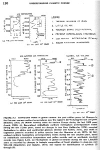
fig. 7: Generalized trends in global climate, in Understanding Climatic Change, US GARP, 1975. (click to enlarge)
The second chart in our fig 7, is figure A2a of Understanding Climatic Change, and it is the first known appearance of our idol. It shows a two-pronged Little Ice Age separating the thermal maximum of the 1940s from the milder middle ages. We don’t know exactly why this chart, of all charts, was constructed to appear in this report. But to understand why a chart was required for such a series, we need to understand a little of the context in the work of the US committee for GARP. (For more context, see this timeline).
The US committee for Global Atmospheric Research Program (US GARP) explains itself thus:
In late 1967 the International Council of Scientific Unions, acting jointly with the World Meteorological Organization (WMO), proposed a Global Atmospheric Research Program (GARP) to accomplish the objectives stated in UN Resolution 1721 and 1802, namely ‘to advance the state of atmospheric sciences and technology so as to provide greater knowledge of basic physical forces affecting climate….; to develop existing weather forecasting capabilities…,’ and ‘to develop an expanded program of atmospheric science research which will complement the program fostered by the WMO.’
Along with improving and extending weather forecasts, GARP was also about ‘the study of the physical basis of climate.’ This is why in March 1972 the US GARP appointed a Panel on Climatic Variation. Understanding Climatic Change is its report as published in 1975 by the National Academy for Science. The subtitle ‘a program for action’ refers not to a program of climate change mitigation, but rather to a program for massively funded research.
The work of the Panel had been divided into three categories, depending on the timescale of climatic variation. It explains:
First, the shorter-period variations, of the order of 10-1 to 10 years, which are documented by modern instrumental observations; second, the variations of intermediate length, of the order of 10 to 103 years, which are largely documented by historical and proxy data sources; and third, the longer-period variations, of the order of 103 years and beyond, for which documentation comes from paleoclimatic and geological records.
The deliberations of the sub-panels concerned with decadal to millennial changes were chaired by two of the world’s leading climatologists of the 60s and 70s, J Murray Mitchell and Wallace Broecker. Their results are the subject of a substantial appendix called ‘Survey of Past Climates’ which gives a summary of the research on climate variability in successive timeframes from 100 to 1, 000, 000, 000 years. The set of 5 charts (our fig 6) reflect the structure of the survey by summarizing generalized trends in global climate in 5 timeframes: 102, 103, 104, 105 and 106 years. Thus, presentation of these temperature charts in this metric arrangement only reflects the scoping of the report. As far as we know, this was the first time such an arrangement of charts appeared.
The first chart (A2.a) gives the results of work begun by Willet in the 1950s and continued by Mitchell in the 1960s to give one of the first real attempts at the global temperature trend over the last century. The last two charts (A2d) and (A2e) use the latest proxy techniques to estimate global temperature changes on a geological scale. The chart trending back through the Holocene (A2c) into the last ice age is from various proxies giving the mid-latitude trend for the northern hemisphere. But the millennium chart (A2b) stands out for giving the trend for only one location. Not only that, the trend it gives is not even of temperature.
The caption explains that the millennium chart gives ‘winter severity index for eastern Europe.’ The reference for this chart is to a chapter Lamb had written for the World Survey of Climatology (Vol II, 1969) on ‘Climatic Fluctuations’. This summary of Lamb’s work contains many of Lambs standard set of charts giving climate variability across Europe and the globe, but the millennium chart in the US GARP report (A.2b) is nowhere to be found. However, a version of the winter severity map is reproduced in the survey on page 229 where it takes up the entire quarto sheet. If one draws a vertical line at the 35o mark then the millennium chart in the US GARP report is approximated. We will presume that this is the derivation of the millennium chart until some other source can be identified.
Why was this chart generated to stand in for the trend in global climate?
We cannot answer this question at this stage, but a few curiosities around this graph are worth noting.
Firstly, the chart does not use the data specific to central Russia (35o E) as listed by decadal means in the appendix to Lamb’s original paper. These decadal tables do not appear in the World Survey of Climatology article as cited, but anyway, if these data are graphed as a smoothed curve, it has noticeable differences such that it leaves the 35o line on Lamb’s map as a much closer match.
The second curiosity is that the source of the data for this part of eastern Europe does not seem to be from any data collected by Lamb except via the work of a Russian scientist, I E Buchinsky. Lamb cites The Past Climate of the Russian Plains, which is most probably this Russian language text.
The third curiosity is that the reference to the chart in the text of the US GARP report appears contradictory:
Prior to the period of instrumental record, historical climatic data are found in books, manuscripts, logs, and other documentary sources and provide valuable (although fragmentary) climatic evidence before the advent of routine meteorological observations. Lamb (1969) has pioneered the collection of such data and has charted the main course of climate over Western Europe during the past 1000 years (Figure A.2b). [p129, emphasis added]
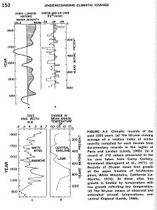
fig. 8: Additional millennium charts in the GARP report include a Paris-London winter severity index and a version of Lamb’s extension of the Central England Temperature chart.
Western Europe? This is curious because another chart appearing a few pages later does give an approximation of the trend down the most westerly line (0o E) on Lamb’s map. This is the ‘Paris-London’ chart A.9a as shown in our Fig 8, where the severity scale of this chart is blown out to give about the same range of variability as found in the east. And here we have a different story again! The Little Ice Age is concentrated into the 17th century, while the warming peak in the mid 20th century is again warmer than most of the medieval period, but much more extended.
Notice also in our fig 8 that A9d is a version of Lamb’s English temperature chart–the model for the IPCC chart as discussed in Part I of this essay–complete with the huge medieval hump noticeably eroded in all the other millennium charts. This England chart is referenced to an article published by Lamb in 1966. However, the original set of three English charts (our fig. 2), from which both this and the IPCC chart (fig 1) are derived, is found in Lamb’s World Survey of Climatology essay on the page facing the winter severity map. Thus, the spread on page 228 and 229 of the Survey gives, one before the other, the source for our first two millennium idols.
The layout of the US GARP report is just as the scoping of the assessment, and so divided into sections according to timeframes. The section ‘The Last 1000 Years’ explains how the index of eastern European winter severity have been calibrated by Lamb with instrumental temperature records, and then, with something of a leap of faith, it generalizes Lamb’s results to the Northern Hemisphere temperature trend generally. This is how it can chart the story for one hemisphere at least. This story includes a ‘Middle Ages warm epoch’ that was ‘evidently not as warm as the first half of the 20th century’ and it includes ‘the period from about 1450 to 1850…commonly known as the Little Ice Age’ with its two prong cold maxima (p149-151).
This set of 5 charts in the US GARP report (fig. 7), in both their form and their content, would be influential in the US climate discourse for the next decade. Below we give some of the assimilations and variations of this set of graphs that we have discovered so far in various publications, including in climate assessments reports. Any further sighting will be gratefully accepted!
UPDATE: 1976: In an Australian Academy of Science report on climatic change published in March 1976, the 4 proxy charts from the US GARP report are ‘re-scaled and simplified’ (fig 1.4 p18-19). The final chart showing the successive interglacials is labelled ‘global ice volume.’ The other charts are labelled ‘the trend of air temperature,’ but the caption explains the indirect nature of the indicators by saying that they show ‘the incidence of events related to major temperature fluctuations in the geological past.’ It also says that ‘all data are substantially generalised.’
1976: ‘What’s Happening to Our Climate?,’ Samuel Matthews, National Geographic
fig. 9: The US GARP charts as they appear in the National Geographic feature, Nov 1976
An extensive series of articles based around the US GARP climate report appeared in the November 1996 issue of National Geographic. This feature includes interviews with many of its contributors. In these interviews, as in the feature as a whole, a major theme is skepticism in the classical sense: we don’t know and we don’t even know what we don’t know. Right at the end of the 39 pages we find a set of 4 charts similar to the set of 5 in the US GARP report. Indeed, they are all directly derived from the report. One major difference is that the centennial chart is derived from a Russian data set that became popular in the USA as first transmitted by Budyko in the late 1960s and then later by Vinnikov (see more here). A version of this Russian chart also appears in the US GARP report as fig A6.
The caption to the National Geographic set of 4 temperature charts explains that all temperatures are for the Northern Hemisphere, but this is further qualified for the millennium chart (our fig. 5), where a special label reads ‘air temperature, eastern Europe.’
1977: ‘Some considerations of climatic variability in the context of future CO2 effects on global-Scale climate,’ J Murray Mitchell (1979)
The following year, one of the scientists featured in the National Geographic article, J Murray Mitchell, presented a paper to a workshops sponsored by the United States Department of Energy’s Carbon Dioxide Effects Research and Assessment Program (the proceedings were published in 1979). Mitchell’s paper gives some considerations of climatic variability for the workshop primarily concerned with ‘…the Global Effects of Carbon Dioxide from Fossil Fuels.’ His discussion is based around a facsimile of the US GARP set of graphs as they appear in the National Geographic article. The article begins: ‘When contemplating the significance to climate of a long-term increase in atmospheric CO2 we must recognize that the natural climatic system being perturbed by the CO2 in a system that exhibits a considerable degree of inherent variability….’
The facsimile of the National Geographic version of the graphs is label: ‘History of global-scale mean temperature of the earth as inferred from a variety of paleoclimatic indicators, after Matthews…’ In the discussion, Mitchell notes that the millennium chart is derived from data for eastern Europe and that ‘we cannot be certain that this index is representative of the hemisphere as a whole, or of the world as a whole, but it is probably indicative of global-scale changes.’
1978: Proxy data : nature’s records of past climates, NOAA (USA)

fig. 10: The US GARP charts as they appear in a 1978 NOAA pamphlet
According to Thompson Webb** the US GARP charts are again re-fashioned in this 15 page NOAA pamphlet.++ This version is of interest mostly because it organizes the original GARP series in a more orderly fashion (fig 9). This time the charts give ‘general trends in global climate’ with the millennium chart giving ‘air temperature’ from ‘historical information.’
**Webb T (1991) ‘The spectrum of temporal climatic variability: current estimates and the need for global and regional time series.’ In: Bradley RS (ed) Global changes of the past. UCAR Office of Interdisciplinary Earth Studies, Boulder, Colorado, pp 61–81
++Proxy data : nature’s records of past climates by J. Christopher Bernabo, NOAA, 1978 p7.
1982: The Carbon Dioxide Review: 1982, William Clark (ed.)

fig. 11: The National Geographic version of the charts are re-fashioned for the Carbon Dioxide Review (page 449)
This substantial compilation of essays is unusual as it gives some analysis of the scientific debate, including charts of how predicted date of achieving CO2 doubling (and of climate sensitivity) has trended over the decades. It also gives actual demonstrations of the debate with presentation of the scientific disputes in key commissioned articles followed by a series of critical commentaries.
In the ‘DATA’ section at the back, the National Geographic version of the US GARP chart are digitized and re-fashioned again. This time the 100-year instrumental trend is removed from the display and given elsewhere. The remaining charts are presented in a more consistent decimal-graded scale and with a consistent vertical temperature scale. The latter makes it clear that amplitude of variability decreases as timeframe decreases. The caption explains that the set of graphs give ‘an approximate temperature history of the Northern Hemisphere.’ The source of the data is obscured. Only in the accompanying text is it mentioned that the millennium chart is restricted to ‘temperatures from eastern Europe’.
1983: Changing Climate: Report of the Carbon Dioxide Assessment Committee, National Academy of Science (USA)
This is the report of a comprehensive assessment by the National Research Council as mandated by the Energy Security Act of 1980. After speculating a probable increase in US temperatures of 3o to 4o C with a doubling of CO2 concentrations, there is a section titled: ‘The Problem of Unease About Changes of This Magnitude.’ This is where a facsimile of Clark’s version of the charts (fig 11) appear. The only difference is that this time they appear with a cautionary caveat alarmingly absent in Clark:
‘Considerable uncertainty attaches to the record in each panel, and the temperature records are derived from a variety of sources, for example, ice volume, as well as more direct data. Spatial and temporal (e.g. seasonal) variation of data sources is also considerable.’
Even so, the reader would never guess, and would have no easy means for finding out, that the lower chart is only a vague indicator of the harshness of winters in the region around Moscow.
Was this the last that was seen of this idol? Unlikely. I do expect further publications to be found. Perhaps there are also some other sets of temperature graphs that never achieved iconic status. Here is one….
1986: ‘Climatic Instability, Time Lags, and Community Disequilibrium,’ Margaret Davis

fig. 12: Northern Hemisphere temperature change from ‘Climatic instability, time lags, and community disequilibrium’ by Davis in Community Ecology, 1986
The set of charts in fig. 12 are by Margaret Davis published in her chapter of an ecology textbook called Community Ecology. In the caption Davis explains the charts various diverse proxy types and the diverse regional sources all in the Northern hemisphere. One striking graph is 16.1C. This is her own very smooth 10,000 year chart for north eastern United States (note how it has more resemblance than most to the IPCC Holocene chart in fig. 3).
In 16.1B we find there is yet another, and very different, millennium graph. And it also comes from Lamb! This graph is labelled ‘reconstructed air temperature over the last 1,000 years in the North Atlantic, based on accounts of sea ice,’ with the source given as Vol. 2 of Lamb’s magnum opus, Climate, present past and future. For a graph from the north Atlantic, for a graph from Lamb, this graph is extraordinary for its lack of any suggestion of a MWP hump. But the lack of a hump might be explain by its source in regional accounts of sea ice, where the upper limit of this warmth indicator is the lack of any sea ice. No identical graph can be found in Lamb, but fig 17.13 on p452 we find a column chart of the incidence of sea ice at the coast of Iceland to illustrate his discussion of the Little Ice Age. If Davis’ chart is turned upside down it matches Lamb’s chart, including the flat section in the 180 years prior to 1200 AD when no coastal sea ice was recorded. Whether Davis’ chart requires a zero line along the top is an open question, but we can say that Davis does not seem to acknowledge medieval warming anywhere in her essay. She only describes, just as the graph shows, a deterioration into, and then recovery from, the Little Ice Age.
Reflections on a Carolingian warming
So what does all this iconography tell us?
With the posting of the first part of this essay, quite a lot of feedback was received about the plethora of recent evidence for a global MWP. This included lots of links to lots of evidence of medieval warming at various times in various regions of the world. There were also some links to studies that combined data from various regions to give a global mean trend. This debate about recent evidence is beyond the scope of this essay. However, let us just consider the most commonly referenced global chart published by Loehle & McCulloch in 2008.
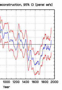
fig 13: Loethle & McCulloch (2008) truncated to the millennium
What is immediately striking about this chart is that it does not match the IPCC First Assessment chart at all. It has a distinct trough is the 12th century and early 13th century right where the IPCC graph peaks. Indeed, its own peak is much earlier, in the 9th century. This peak would not even appear on a millennium chart! The Loehle & McCulloch chart is saying that during the high Middle Ages, when all those Gothic cathedrals went up in the name of the mother goddess, there was no generalized warming peak. The peak is not (high) medieval but Carolingian! Moreover, consider what happens when we truncate this graph so that it covers only the last millennium (fig 13). This would be so as to compare it with the millennium chart in IPCC First Assessment and the Hockey stick of the Third. I leave it to the reader to decide which one it resembles the most.
As we said in the beginning, of the 3 millennium idols considered, none of these charts are any good. Whether Loethle & McCulloch, or some other global or hemispheric chart published since 1990 has been able to capture the generalized trend, this is not in dispute here. But I would like to finish by noting the basis of the skepticism of the IPCC Second Assessment Report. That is, the skepticism of the detection of manmade climate change as expressed in the concluding summary of Chapter 8 — the one removed after its submission to the IPCC plenary (more on that here).
Prior to the IPCC Second Assessment, all the previous official assessments did not claim detection. Instead, they only ever discussed how and when it might be achieved. This included the IPCC First Assessment, which speculated that detection was unlikely to be achieved until there was another ½oC of warming. This skepticism was mainly due to any human effect being masked by the noise of natural variability.

fig. 14: A comparison of 3 proxy reconstructions from 1600 for the northern hemisphere. (Click image for details)
In the IPCC Second Assessment, this skepticism went further. This was mostly due to a study by Tim Barnett which attempted to establish the extent of global climate variability on a centennial scale. Once established, this variability could provide the ‘yardstick’ against which manmade climate change could be measure. However, he concluded that the proxy data was too spare and too unreliable to provide such a yardstick. And without such a yardstick detection of manmade warming could not be achieved. A much more comprehensive follow-up ‘status report’ on the detection question published in 1999 (pdf) confirms his skepticism. In it Barnett et al consider the three tree ring proxy graphs published in 1998 (as mentioned in the introduction above), including the first (shortened) version of the Hockey Stick. Barnett notes that the extraordinary variability between these graphs is, in itself, a reason for continuing skepticism that any of them might yet have found the ‘yardstick’ (fig 14).
Barnett has never been an AGW sceptic, but after these studies he abandoned the idea of detecting climate change in this way. These days he derides the very notion of a global mean temperature. He calls it the ‘idiot number.’ We like to think he would agree that these charts are idiot charts, idols one and all. We should note what a terrible distraction they have been. And then smash them all. Because, as indicators of some supposed global trend, none of them can do us any good.
____________________________________________________
_______________________________________
Note 1 UPDATE: In ‘Chapter 6: Empirical Studies’ of SCOPE #29 (prepared for Villach ’85 and published in 1986), Wigley et al gives reason why there is no centenary-scale graph depicting the global temperature trend across the recent Holocene. Section 6.2.4 on climate change from 6000 BP to 1850 AD explains:
Many warming and cooling episodes occurred on the 100-year timescale. Because these events are only observable through indirect or proxy evidence, which is both local and often poorly dated, we do not know how global mean climate changed, or even if global mean temperature has changed since, say, 6,000 BP. Regionally, however, substantial changes have occurred…
(p277, emphasis in the original)
This is followed by a discussion of the MWP and the Little Ice Age and the large differences in their timing across the affected regions of the globe.

Bernie, good collection. Have you looked at Reid Bryson’s work. He was also active and influential in this period.
Steve, Not much. I don’t recall any comparable graphs. But I will look again. I did wonder why the American assessments did not give the local hero more attention, with too much attention to Russian and English sources overshadowing his work on North American climate, and I did wonder if this had anything to do with his fame more for concern about man-made cooling with his ‘human volcano.’ That could be interesting to explore.
I do know that in the early 1960s, before Lamb started using ‘middle ages optimum,’ ‘medieval climatic optimum’ and ‘medieval warm epoch’, he quotes Bryson’s ‘little optimum’. This term was to complement the already used ‘little ice age’ and as compared to the big optimum earlier in the Holocene. However, I presume the term was dropped for the same reason Lamb stopped using ‘secondary climatic optimum,’ that is, so that Lamb could distinguish the various (European) optimums, including in the one in Roman times.
UPDATE: Climate of Hunger by Reid Bryson and Thomas J Murray published in 1977 to raise alarm about global cooling has a section called ‘Sketches of the past’ that uses the US GARP set of charts.
Bernie — your link to Wikipedia for J. Murray Mitchell goes instead to John F.B. Mitchell’s Wikipedia profile. You want this one: http://en.wikipedia.org/wiki/J._Murray_Mitchell
Fixed. Thanks.